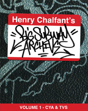
Last year, Apple’s iPad was bombed with the exclusive release of Henry Chalfant’s “Big Subway Archive Volume 1 – CYA & TVS” (later renamed Henry Chalfant’s Graffiti Archive: New York City’s Subway Art and Artists). The archival series will eventually comprise of photographs of over 800 New York City MTA Subway cars emblazoned with graffiti artwork. The photos were mostly taken in the early-to-mid 1980’s, arguably the artistic high point of New York subway graffiti. Interspersed between subway car photos are interviews with the artists. The archival series is special to me because I literally saw the first version of these archives decades ago. I will say right off the bat this series is a must-have for anyone remotely interested in graffiti. I do have some issues with the released volumes however, and the volumes themselves compel commentary from virtually anyone that sees them –and I’m no different.

Back in the 1980’s I visited Henry’s studio with my writing pals Badroc and Dasez. We came all the way from Pittsburgh to see the mecca of graffiti at that time, New York City. One of the high points of our trip was visiting Henry Chalfant’s studio on 64 Grand Street. To this day, every writer in New York alive at that time remembers that address. Henry had five behemoth photo albums filled with train photos spliced and glued together to display the whole car.
We spent hours studying these trains. The styles, somewhat primitive compared to today’s standards, seemed so amazingly out-of-reach of anything we could do. I can remember thinking and saying, “Wow, look at that “L.” Everything about New York graffiti seemed more alive, more tuff, more original and more real than anything I’d ever seen. I wasn’t the only kid that felt this way, writers from all over the city and world would come to marvel at these albums. These archives did as much to generate graffiti style all over the world as did Henry’s book Subway Art and his movie Style Wars.
And what albums they were! Besides each weighing about 30 pounds, they were rat-chewed on the side (or did a writer do that?), some trains were missing because occasionally writers would steal certain photos, and they were tagged up here and there. Now, when me, Dasez and Badroc visited the studio, there were also other writers there and Henry himself. Guaranteed you would be hearing some tall tales of unbelievable police chases, writer beefs, zip-gun battles, and unsubstantiated claims. This is an extra reason why “HCGA” is so great, the writers are interviewed on video and go over all these stories themselves, in conjunction with the photos and sketches of their art pieces.
I do have some beefs with HCGA though. First, it’s iPad only. I had to get an iPad just to enjoy these volumes. If you are in the same boat I was, here are a couple links to get one. Amazon has some good deals here, on an [easyazon_link asin=”B00746W3HG” locale=”US” new_window=”default” tag=”lelifohotr-20″ add_to_cart=”no” cloaking=”default” localization=”default” nofollow=”default” popups=”default”]Apple iPad Mini[/easyazon_link] and you can get a used iPad 1 on eBay now for about $150 here. I’m kinda glad I got one though, because I avoided Macs for a while and I have to say the iPad is more comfortable to use than the Android tablets I’m generally familiar with.
Once you’ve paid your tribute to the ghost of Steve Jobs and get the books from the iTunes Store, you’re ready to go. I had a little trouble navigating at first, but that just may be me. My biggest gripes are with the zoom feature of the trains. It “snaps back” and doesn’t allow you to zoom and hold a particular area of the train. This is somewhat offset by an extreme scrolling close-up image that each car has, but I think it’s more natural to want to zoom and scroll at your will. This might be a general drawback of the iBook format.
The next problem I have is with the backgrounds of the subway cars. It looks like the photos were pasted on a black book that was tagged up with Design markers, and that is the general motif of the series – I guess as an ode to the black books that delineated the styles on the train. However, I liked the pitch-black background of the original archives. I think the fancy backgrounds somewhat distract from the artwork. My opinion might be different though if the zoom feature was updated. And, maybe as an ode to writers pilfering photos from the old photobooks, volume 1 is missing 2 photos! Of course, these are small concerns overall, but I do hope they get fixed in upcoming installments or updates.
Volume 1 – CYA & TVS

Volume One features the art of Crazy Young Artists and The Vamp Squad. The crews’ most famous members were Daze (CYA) and T-Kid (TVS). Any fan of either of these artists will appreciate their archived early work in this volume. The introduction to the series is written by Chalfant, and it shows why his productions have launched more graffiti pieces than perhaps anyone else on the planet. He’s a really good writer and one of the best of the genre. No small feat when you are being compared to the likes of Norman Mailer (who wrote “The Faith of Graffiti)! Chalfant’s writing briefly recreates the 1980s. Combined with the photos of New York City at that time the prose really brought it home to me. The sweltering hot New York City summer air and the smell of piss and oil clouding the lay-up as I waited to see the next burner roll onto the platform.
I’m curious how new writers born after-the-fact would react to these introductions though – if they would be resonant? From my mind it seems all the elements are there. In fact, there are aspects of the early graffiti years that Chalfant touches on that are controversial today and even I wince at mentioning some of the real history. For example, Chalfant mentions the drugs that permeated New York at that time –and the writers. Sometimes I want to ignore this part of history because it has some bad outcomes and I don’t want to encourage similar behavior in newer writers, but the fact was it was there. Today’s society has even worse drug problems throughout the Western world, but the 1980’s New York City was a particularly acute period of drug activity in every borough.
You also have to deal with the fact that, if you have children, exposing them to this world may enamor them with, well, crime. Let’s face it, graffiti is exciting and it walks the razor edge of art and crime, clumsily falling on each side and always will. Youth are attracted to power. The tales of police chases, fights and thievery ignite the imagination as much as graffiti’s powerful art form. I can only advise careful parental oversight in this regard, but fortunately the interviews with the writers themselves aid in this conceptually challenging conundrum. Three interviews with Baby 168, Shock 123, and Daze give a nice introduction to various approaches, attractions and outcomes of graffiti in the 1980s.
First up in Volume One is the interview with Baby 168. This interview might as well be straight outta Henry’s old studio. Baby describes a police raid in which he and his friends barely got away. Only by taking a huge leap off of a 30 foot high platform (ok it probably wasn’t 30 feet but that’s what he says) did they get away.
Next up though is Shock 123, and this interview will make you cry. Shock ended up going to prison for 17 years because of accidently killing another writer during a graffiti beef. I say accidentally because when you are young you don’t know what you are doing, really. The victim and his family my heart goes out to and you can imagine how Shock must have felt, and still feels, having this burden to carry with him. Just for a graffiti beef.
In contrast, CYA formed in art school, and it becomes apparent that the circumstances of TVS were a lot rougher than CYA. There was more competition and less space to paint at TVS’s usual yards, they were muscled out by drug dealers, and found themselves picking fights maybe as a reaction to the adversity of their situation.
The last interview in the volume is with Daze. He and the Crazy Young Artists mostly avoided beefs with other writers, and it shows in their resulting artwork. The Daze pieces are studied whereas the TVS pieces, as great as they are, look rushed at times. Daze’s interview concentrates more on his career as an artist, from his admiration of the trains when he was young, to his graffiti years and then his career as a gallery artist.
The Photos

One of the greatest things about the old archives was that you saw trains and pieces you didn’t see before and never probably would see: the long since buffed, or for one reason or another didn’t make the cut into Subway Art or Style Wars, or were taken after the fact. As a connoisseur of style, these were the pieces that fascinated me the most. And frankly, some of the best work never made it into Subway Art because they were made after it went to press. Those last dying days of the trains featured some of the most advanced window-down burners. Well, now they are here! If you love graff then you probably feel that if a book has even one photo of a great piece it’s worth the price. Well, this series has scores of photos and pieces you’ve probably never seen before.
Some highlight pieces from Volume 1 are definitely the T-Kid Booze window downs. There are quite a few of them and these were made Post-Subway Art. Ken is represented as well as some nice Zone pieces. Lots of window downs for Shock and Min, some Shy 147, Kel and Duro. Granted, some of these guys weren’t strictly TVS but they painted together enough that they are represented here.
Moving to the CYA portion of the book you get a lot of great Daze window downs and a couple whole cars. This description doesn’t do justice to all the great work in this portion though, because CYA seemed to do other names than their main on a fairly regular basis. Another small criticism I have of the book is that there should be footnotes with some of the trains to let you know who really did them. For example, there is a “Daze Bus Zeph” window-down car in this volume. This car is somewhat well-known in graffiti circles, but new-jacks wouldn’t know off-hand that “Bus” was really “Dondi”.
In conclusion, this iBook is a great addition to anyone’s iPad with the caveat that parents should take extra care to guide their children through the intellectual and emotional minefield that graffiti art can potentially be. Depending on the fleeting whims of society graffiti is either heroic or criminal, and subcultures service both elements and the grey areas in-between. Having said that, If you are looking for a document detailing the nascent stages of the 20th Century’s culmination of modern and popular art, this is it.
*Editor’s note: I will be reviewing volumes 2 & 3 shortly, in the meantime, here are links to all the releases so far in the iTunes store: Volume 1 , Volume 2 , Volume 3

